Dropdown Menu
A dropdown menu is a list of navigational or action-oriented options for user interaction.

Search
Anatomy
The Dropdown Menu component is composed of several layers of components, each designed to ensure flexibility and usability.
Element
Name
Description
Component
-
Content
Includes a Title and optional Description text blocks
-
-
1
Menu Item
Component
Element
Name
Description
Component
-
Heading
A text block for Menu heading
-
-
Menu Items
Includes up to 3 Menu Items
Menu Item
-
Divider
A dividing line below the Menu Items for visual separation
-
Variations
The menu item component has state variations for Enabled, Hovered, Focused, Pressed and Disabled.
Dropdown
Menu Heading
Title
Description
Title
Description
Title
Description
Title
Description
Title
Description
Title
Description
1
2
3
Title
Description
Title
Description
Title
Description
Title
Description
Title
Description
Title
Description
2
Menu Section
Component
Menu Heading
Title
Description
Title
Description
Title
Description
3
Menu
Component
Offers flexibility in organizing content through variable section counts (1–3).
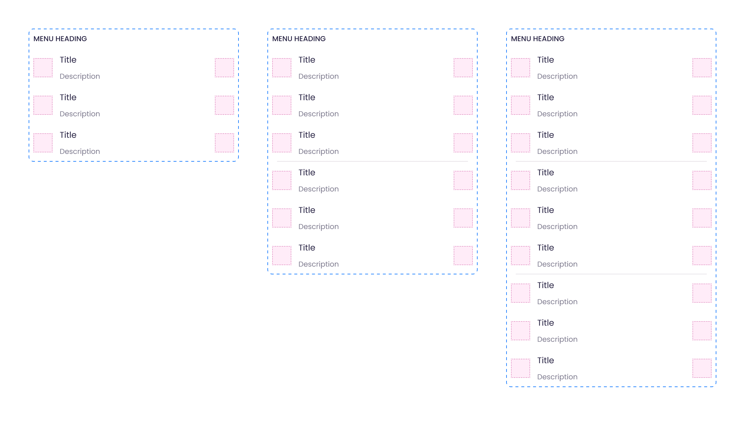
1 section
2 sections
3 sections
Variations
Consists of 1, 2, or 3 Menu Sections to accommodate different levels of categorization.
Dropdown Menu
Component
Variations
Adapts to usage scenarios with Open/Closed states and alignment options for placement flexibility.
Dropdown
Slot container to insert Menu
Dropdown
Closed
Open
State
Closed, Open
Dropdown
Menu Heading
Title
Description
Title
Description
Title
Description
Dropdown
Menu Heading
Title
Description
Title
Description
Title
Description
Left-aligned
Right-aligned
Alignment
Left-aligned, Right-aligned