Card
Cards are structured containers to display content and actions on a single topic.

Search
Anatomy
The Card component is a versatile building block designed to present information in a structured, visually appealing, and functional manner. It is composed of several subcomponents, each tailored for specific purposes, making it flexible for various use cases, including e-commerce and other content-driven designs.
Status
Status
Card Title
Add a brief overview of the content here to give users a quick insight.
Price
Rating
(People reviews)
Slot container to insert content
Details
Add to Cart
1
3
5
2
4
Element
Name
Description
Component
1
Card Utilities
Component
Status
Status
Image media is a dedicated section for visual content to enhance the card's appeal.
4
Slot
Component
A slot offers customization options, allowing additional elements or layouts to be integrated.
Card Title
Add a brief overview of the content here to give users a quick insight.
Price
Rating
(People reviews)
3
Card Content
Component
Element
Name
Description
Component
-
Title
Highlights the main heading or label for the card content
-
-
Description
Provides a concise explanation or details about the content
-
-
Price
Dedicated text block for pricing details, ideal for e-commerce
-
-
Description
A space for displaying user reviews, ratings, or comments, ideal for e-commerce
-
5
Card Actions
Component
Support Left-aligned or Right-aligned layouts.
Support Left-aligned or Right-aligned layouts.
Details
Add to Cart
Details
Add to Cart
Element
Name
Description
Component
Support Left-aligned or Right-aligned layouts and Full-width behavior.
Card Layout
Component
The Card Layout Component combines all the elements—Card Utilities, Card Content, Card Actions, Image Media, and Slot Component—into a cohesive design structure.
Variations
The card layout component has different layout variations designed to meet various design needs.

Vertical Layout
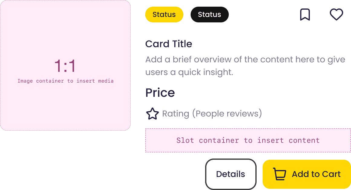
Horizontal Layout
Card Container
Component
The Card Container Component wraps the Card Layout Component and provides consistent padding, ensuring proper spacing and alignment within the design system.
Variations
The card container component has different padding styles designed to meet various design needs.
Slot container to insert Card Layout
Slot container to insert Card Layout
Slot container to insert Card Layout
Rounded-corner/Padding
Sharp-corner/Padding
No Padding