Grid
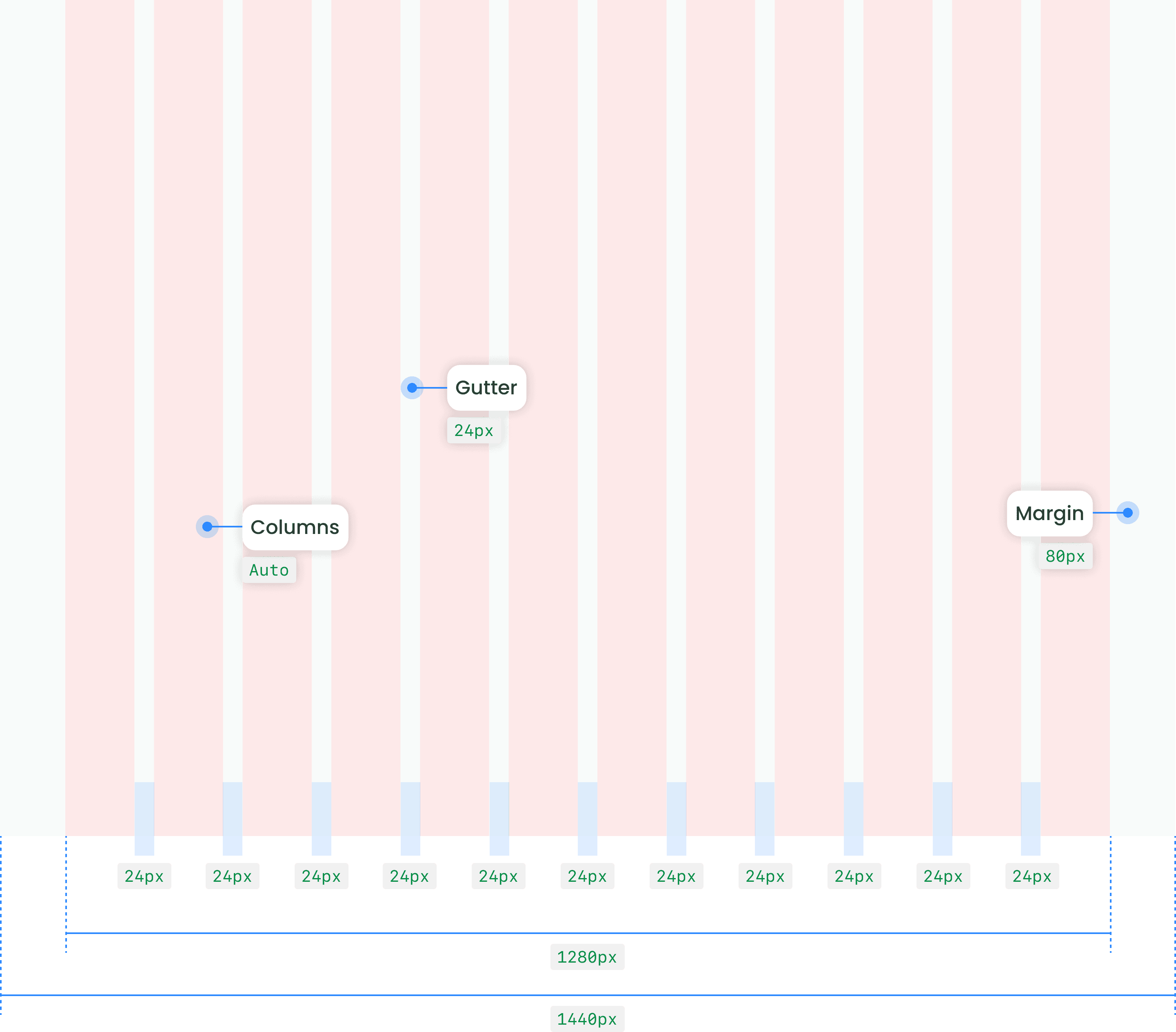
Grids are the structural foundation of layouts, providing a consistent framework for aligning and organizing content.

Search
Kernel adopts a foundational Fluid Grid type, designed to support adaptability and responsiveness. While specific breakpoints and responsive behaviors are not yet implemented, future enhancements aim to make designs seamlessly scalable across various screen sizes and resolutions.
Columns
Columns divide the layout into vertical sections, creating a structure that guides content placement. Kernel's grid system uses flexible columns that scale proportionally with the viewport, ensuring content is always aligned and well-organized.
Gutter
Gutters are the spaces between columns, providing necessary breathing room for content. They ensure clarity and visual separation between elements, helping achieve clean and readable layouts.
Margin
Margins define the outer spacing around the grid, ensuring adequate whitespace between the content and the edges of the screen or container. This ensures content remains visually balanced and free from overcrowding.
Column Span
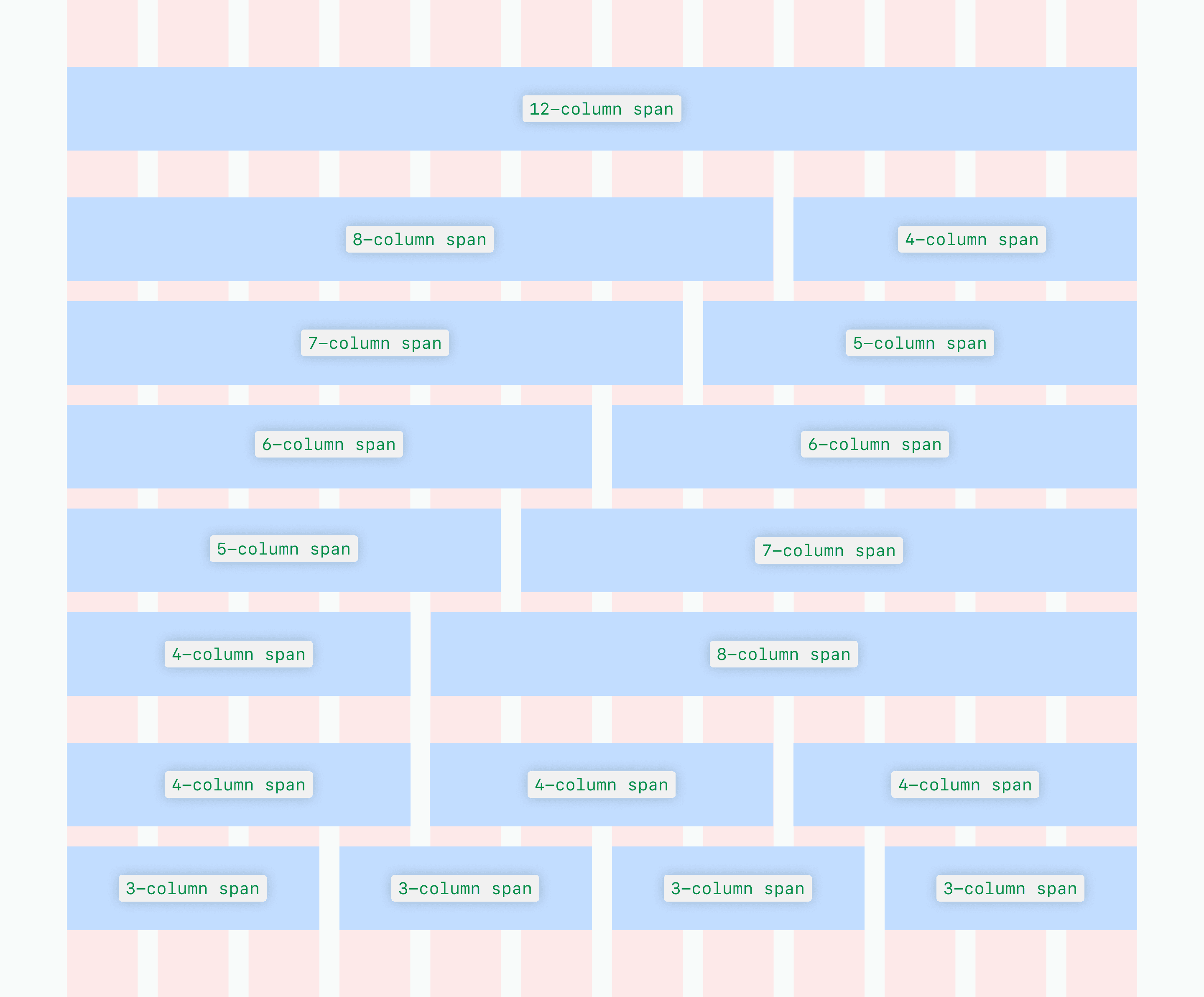
Our 12-column grid system provides a structured yet flexible foundation for designing layouts. Column span refers to how many columns an element occupies within the grid, enabling designers to create layouts with varying levels of emphasis and balance.
Single element
A single element can span across all
12-col
Two elements
One element spans , and the other spans
8-col
8-col
Alternatively, one element spans , and the other spans
7-col
5-col
Both elements can also span each
6-col
Three elements
Each element spans
4-col
Four elements
Each element spans
3-col
Column Offset
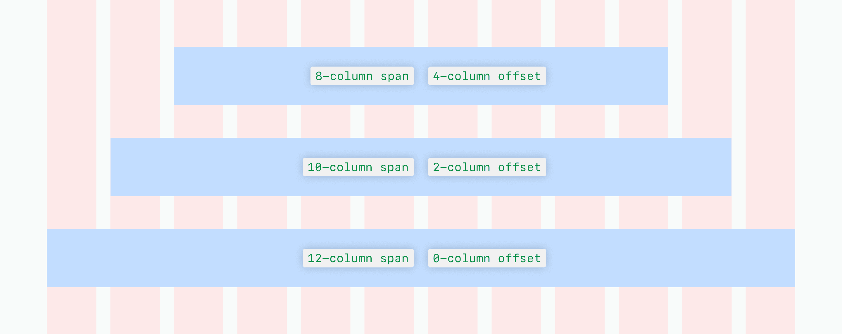
Column offset allows content to be symmetrically centered within the grid by distributing empty columns equally on both sides of the content block. This ensures a clean, balanced layout while maintaining alignment within the grid.